Overview
We are a global Christian leader development ministry. These guidelines exist to ensure every touchpoint – digital, print, training material or presentation – reflects who we are: a consistent, Christlike, trustworthy and visionary presence in the world.
Clarity Over Complexity
Our models are built for everyday leaders, not academics. Our identity should never intimidate or exclude.
Accessibility Across Cultures
We work in dozens of nations. Every design decision must function globally without cultural barriers.
Hope & Movement
Our identity is forward-looking and warm. Growth, light and optimism are core to our visual and verbal character.
Quick Reference
At a Glance
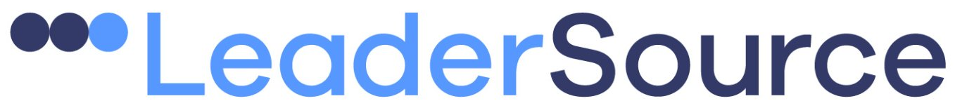
Logo Wordmark
Our primary logo combines the three-dot mark with the 'LeaderSource' wordmark. This is our standard identity for all organizational communications – websites, documents, presentations, email signatures and printed materials.
Light Background
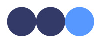
Use on white or light-colored surfaces. The two navy dots and sky-blue accent dot sit to the left of the wordmark, with 'Leader' in sky blue and 'Source' in navy.
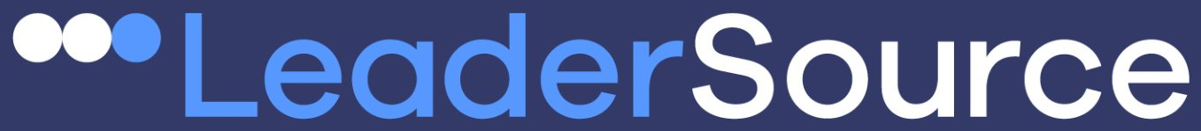
Dark Background
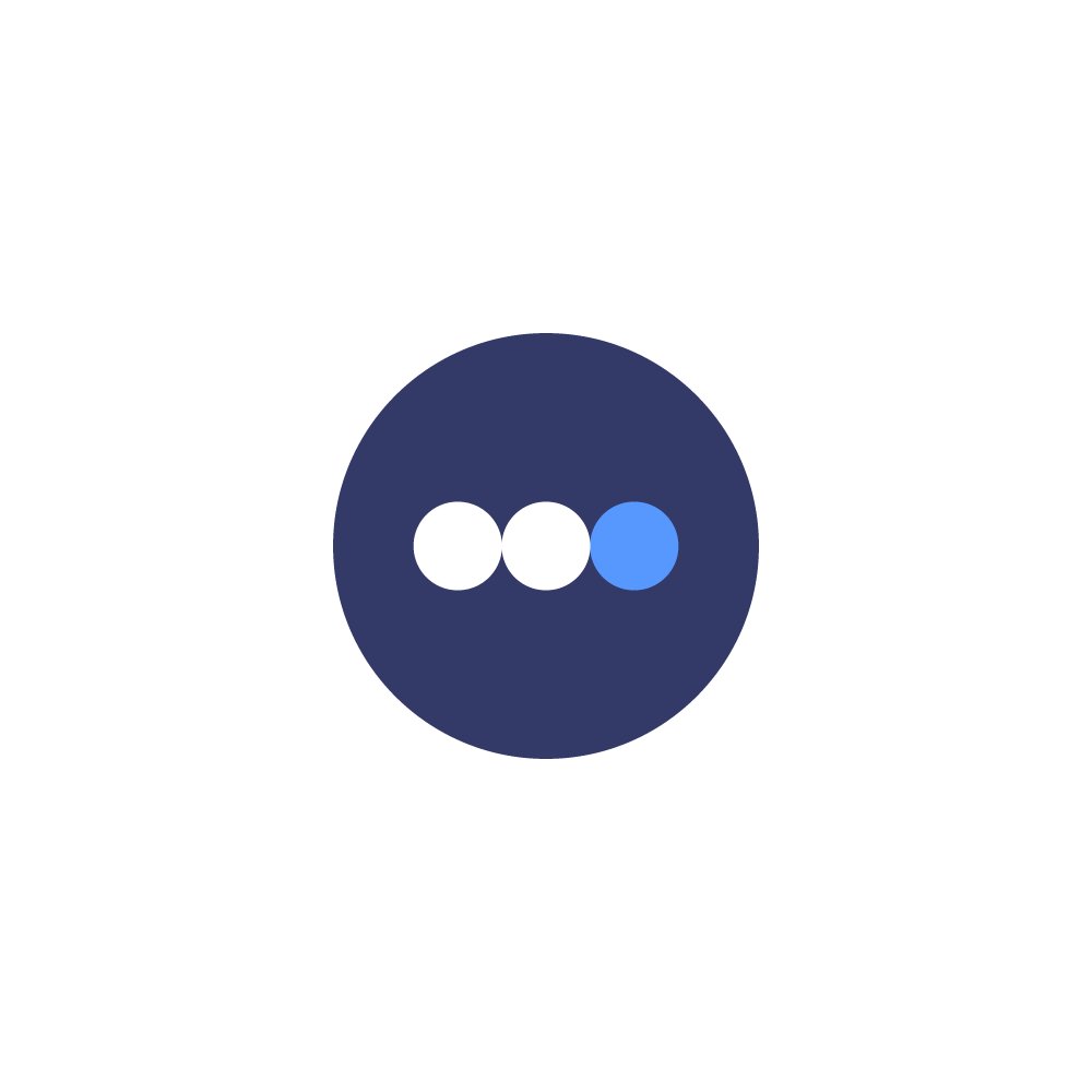
Use on navy or other dark-colored surfaces. The two dots become white and sky blue; 'Leader' remains sky blue and 'Source' becomes white for legibility against the dark field.
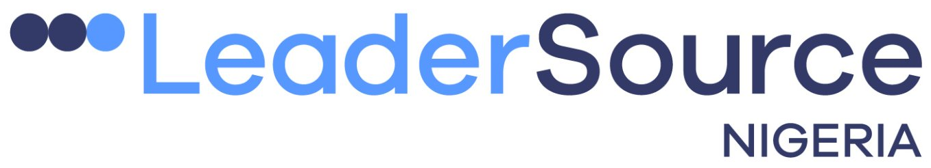
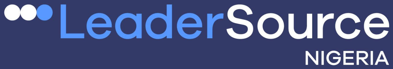
Regional Variants
Regional offices and national expressions use the standard wordmark with a country or region name appended beneath it in navy small caps. The mark and wordmark remain unchanged; only the regional descriptor is added.
Wordmark Usage Rules
Logo Mark
Our mark consists of three circles: two primary navy dots and one sky-blue accent dot. The accent dot signals movement, distinction and the transformational dimension of every leader's journey.


Usage Rules
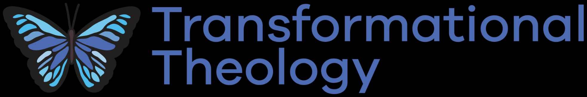
Transformational Theology
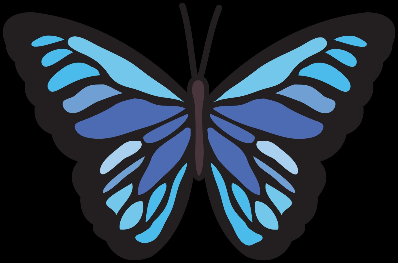
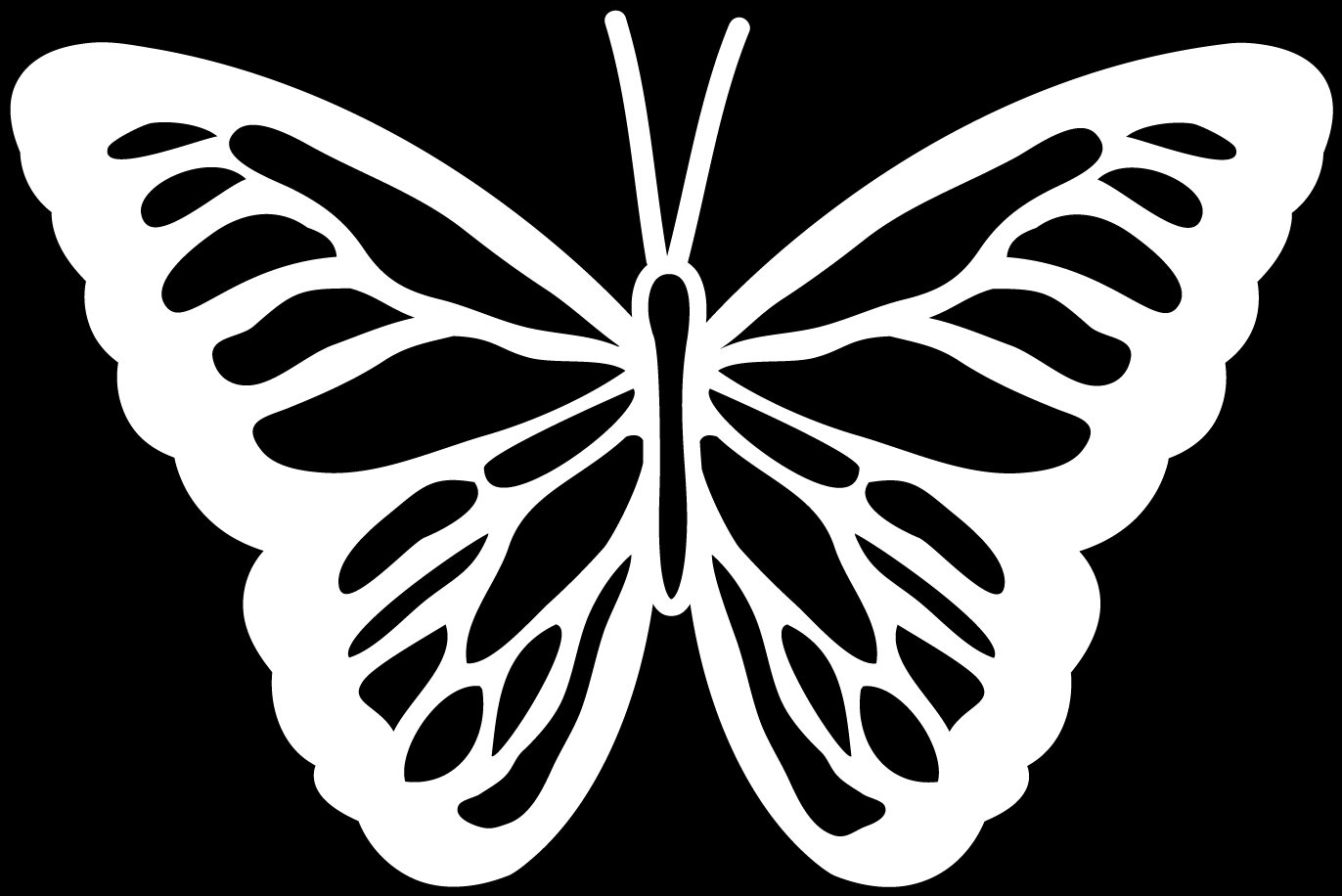
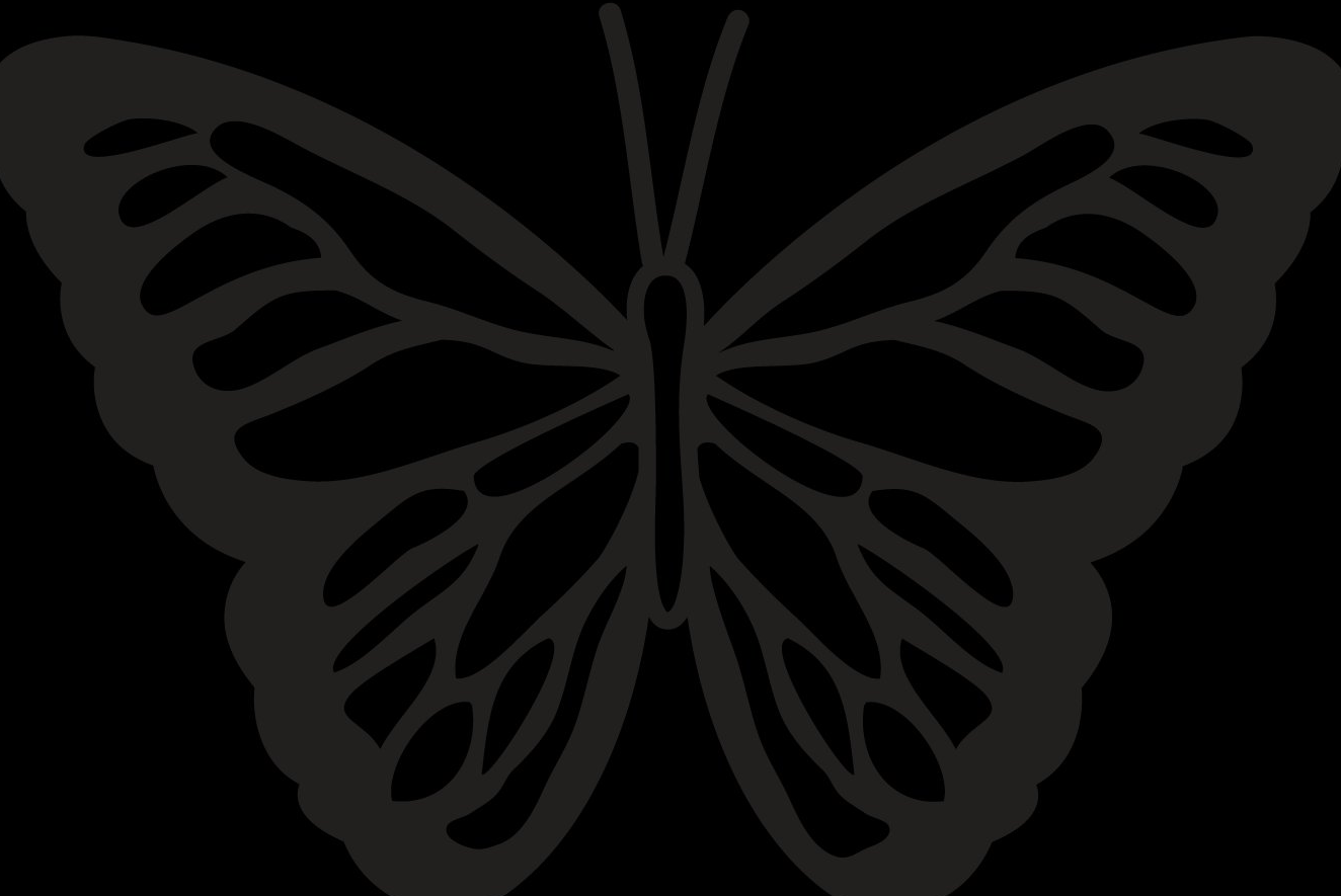
Transformational Theology is our book series on Christian life transformation and biblical theology. It has its own distinct identity – a butterfly mark representing transformation and new life – while remaining within our visual family through shared typography, color language and design values.
Primary Wordmark – Color
The full-color wordmark is the primary usage, reversed out of a black or very dark background.
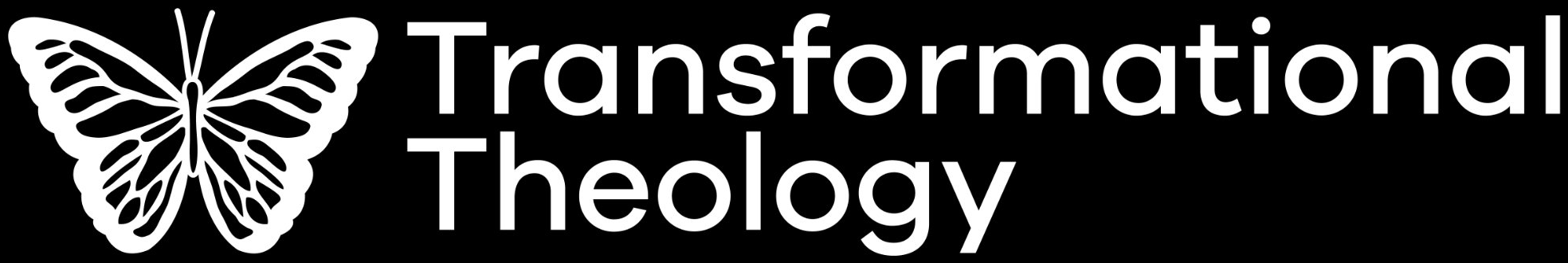
White Wordmark
Used on dark or photographic backgrounds where the color version does not reproduce cleanly.
Butterfly Icon Variants
The butterfly mark is available as a standalone icon in three variants. Use full color as the default, white on dark backgrounds and black on white or light surfaces.
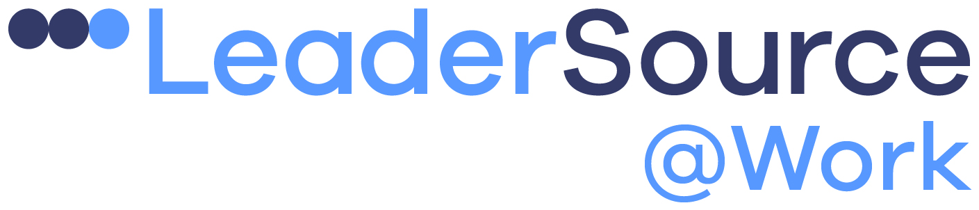
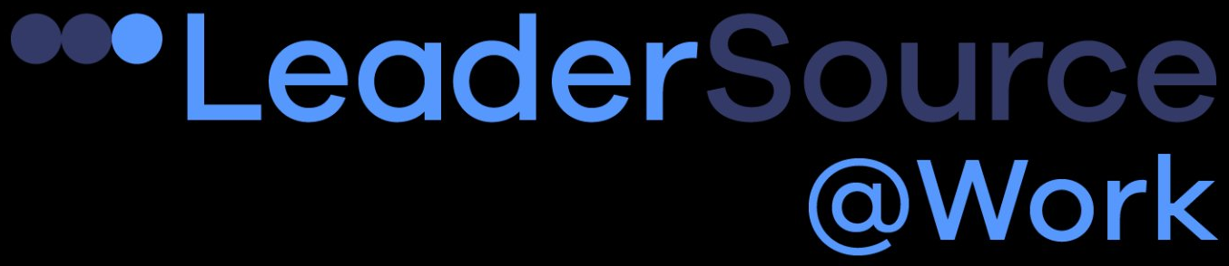
LeaderSource@Work
LeaderSource@Work is the workplace application of our leader development principles. It brings the same theological and relational foundations into organizational and corporate contexts.
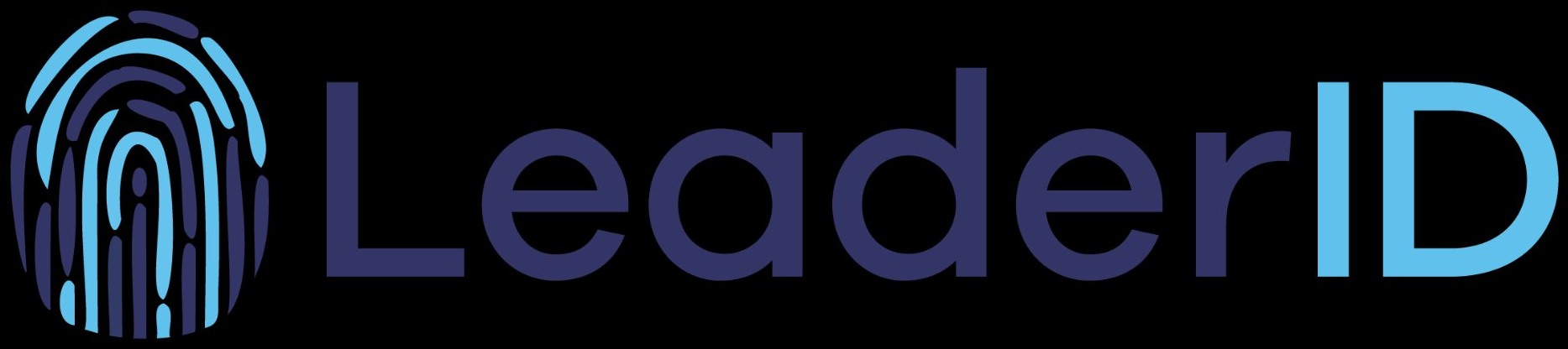
LeaderID
LeaderID is our model for identifying high-potential emerging leaders. Its mark uses a fingerprint icon – representing the identification process – combined with the 'LeaderID' wordmark.
Variant 1 – Navy & Sky Blue
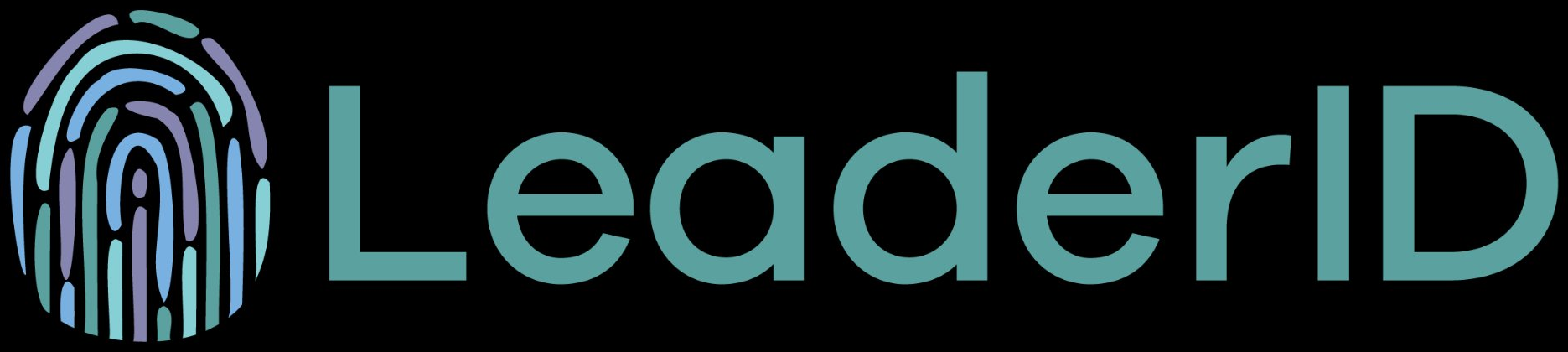
Variant 2 – Teal & Slate
Color Palette
Our primary palette is built on two logo colors supported by a set of extended Transformational Thinking colors for diagrams, models, charts and print materials.
Primary Logo Colors
For print work, always use the Pantone or CMYK values below rather than converting from hex. Click any swatch to copy its hex value.
CMYK: C100 M62 Y12 K65
CMYK: C85 M21 Y0 K0
Extended Palette – Transformational Thinking Colors
This extended set supports our diagrams, model illustrations and training materials. It spans purples, teals, muted blues and greens, all maintaining the accessible, hopeful quality of our primary palette.
Typography
Our primary typeface is Galano Grotesque – a geometric sans-serif that is clean, approachable and highly legible across digital and print contexts. It reflects our commitment to clarity and accessibility.
| Role | Style | Notes |
|---|---|---|
| Primary Typeface | Galano Grotesque | All brand-facing materials: presentations, training resources, web headers, printed documents. |
| Fallback (Digital) | Arial / Helvetica | Use when Galano Grotesque is unavailable in document or system environments. |
| Heading Weight | Bold / SemiBold | Headlines and section titles. Avoid Light weight for headings – insufficient contrast. |
| Body Weight | Regular | Body copy and captions. Maintain a minimum 10pt size for print. |
| Color | Navy or Dark Gray | Black (#000000) may be used but navy (#2D3270) is preferred for brand warmth. |
Design Principles
Simple & Clear
Clean lines, generous white space, clear visual hierarchy. The eye should move naturally to the most important content. Avoid clutter, decoration for its own sake, or visuals that require explanation.
Accessible
Designs must work for anyone, anywhere. Prefer circles and rounded forms over angular geometry. Sans-serif fonts only. Ensure contrast ratios meet WCAG AA at minimum – this means text must be easy to read against its background, with enough difference between light and dark colors that no one has to strain to see the content.
Contextual
We work in dozens of nations. Avoid culturally specific symbols – particularly religious imagery such as crosses – in favor of conceptual, universally readable forms.
Hopeful & Energetic
Images and layouts should be flooded with light and warm color. Subjects should express growth and forward movement. Even when engaging difficult themes, the visual emphasis is always on light and hope.
Voice & Tone
Simple & Clear
Straightforward and direct. No jargon, technical speech or flowery language. Accuracy and simplicity coexist. Every sentence should earn its place.
Personable & Empathetic
Thoughtful and warm. Communication always considers the person on the other end. Conversational in tone without being casual or flippant.
Professional & Trustworthy
Authoritative and tested. Grounded in the Word of God and proven concepts. Avoid speculation, hype or flash. The ministry's credibility is our most important asset.
Words We Use
Words We Avoid
Avoid any language that positions us as a brand rather than a ministry.
Imagery Guidelines
Photography and illustration in our materials should consistently reflect these qualities.
Light
Images should feel naturally well-lit, never dark or moody as a default aesthetic choice. Natural light is preferred over studio setups.
Warmth
Warm tones support the hopeful, relational character of the brand. Avoid cold, clinical or overly desaturated color grading.
Diversity
Subjects should represent the global community we serve. Avoid centering Western or North American contexts.
Movement
People in action – learning, discussing, building, leading. Static, formal portrait compositions should be the exception.
No Religious Iconography
No crosses, steeples, stained glass or overtly Western Christian imagery. We communicate our faith through our people and our message, not through symbols.